 Reports show that over 60% of total digital media time is spent on smartphones and tablets. Mobile search has eclipsed desktop search.
Potential customers are finding small business websites from their mobile devices:
- More than 50% of mobile users rely on their smartphones for purchase decisions
- 59% of users search for reputable local businesses
- 61% of local searches result in a purchase
People come to your website on their mobile device looking for information about you. But what are they actually finding there?
If your website is not optimized for a mobile experience, these folks are probably discouraged by how difficult it is to read what’s on your site, and are probably actively pursuing your competition instead. Stop sending potential customers away from you and instead welcome them with a responsive website.
What is a responsive website?
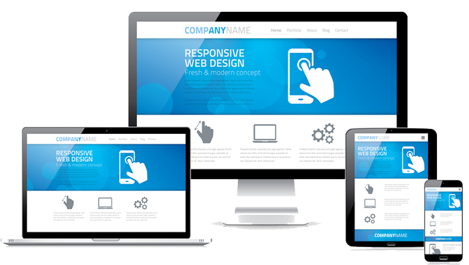
Responsive web design ( RWD) is an approach to web design aimed at crafting sites to provide an optimal viewing and interaction experience—easy reading and navigation with a minimum of resizing, panning, and scrolling—across a wide range of devices (from desktop computer monitors to mobile phones).
-WikiPedia
My website portfolio contains several examples of RWD sites. Just look for the “Responsive Layout” tag under the portfolio thumbnail.
To see if a website is responsive, check it out on a mobile device and see if you can still interact with it on your phone (portrait or landscape). A responsive website will react and adapt to the environment it has to work with; websites using older code won’t be so flexible. You can also use the same tool Google uses to determine whether your website is mobile-friendly.
Responsive websites make Google happy
Something called Mobilegeddon happened in the spring of 2015. After April 21st, Google began including mobile friendliness as a ranking criteria for websites. The algorithm penalizes websites that display poorly on mobile devices.
Do I need a second “mobile-friendly” website in addition to my desktop one?
Not anymore. That used to be the case, but great strides have been made in recent years that allow creation of a single website that responds & reacts to the device it’s being displayed upon. As a WordPress website developer, I use ONLY themes that are responsive.
By choosing a responsive theme for your site, you’ll only need to manage and maintain one website, not two separate ones (one for desktop and one for mobile). You won’t need to worry about SEO for two websites, update plug-ins on two websites or replicate content on both websites.
The bottom line
Responsive small business websites will increase your visibility in search engines and keep you competitive in a mobile-trending world. At this stage of the game, unless you have all the customers you’ll ever need, you really can’t afford NOT to go responsive. I can create a responsive website for you from scratch, or convert your old website into a responsive WordPress website. Contact me today to discuss your situation.
